Components / Website
Story Grid
A three-column editorial mosaic inspired by the customer story index on Mode's customers page. Featured tiles span two columns and include an image; standard tiles are text-only with a logo mark. Distinct from Bento : this layout follows a simple row flow rather than asymmetric cell spans.
Example
The default sample mirrors Mode's rhythm: featured + standard on row one, three standards on row two, standard + featured on row three.
Harbourview
Harbourview Towers transforms committee reporting across 120 lots
Read more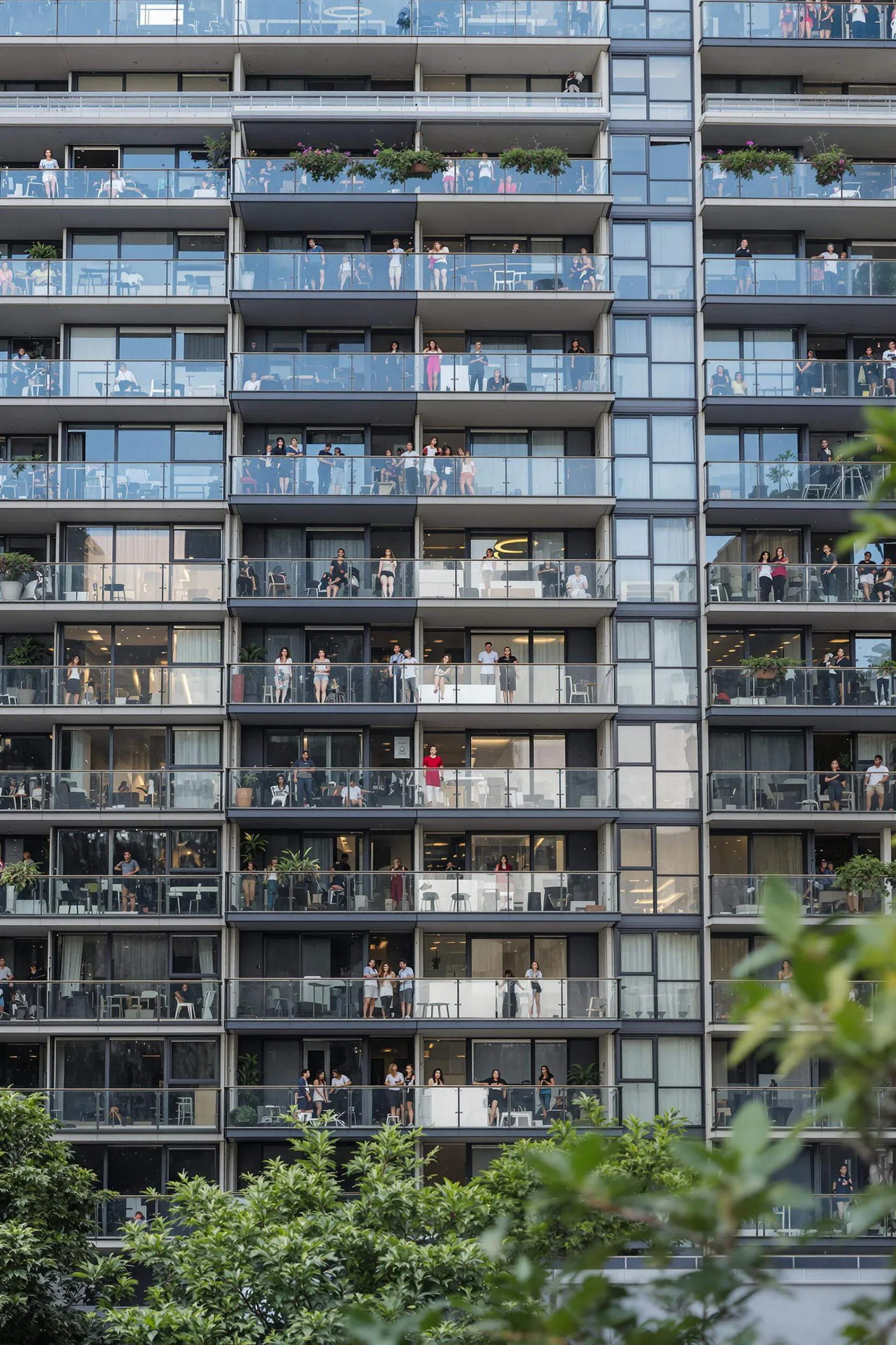
Coastal Strata builds self-serve owner portals
Coastal
Parkside Group accelerates levy reconciliation 10x
Parkside
Northbridge Estates streamlines AGM preparation
Northbridge
Greenline managers cut maintenance response times by 40%
Greenline
Metro Strata
Metro Strata increases owner satisfaction with daily building metrics
Read more
Installation
bash
npx shadcn add https://raw.githubusercontent.com/levi-putna/elements/main/registry/story-grid/registry.jsonUsage
tsx
import {
  StoryGrid,
  StoryGridFeatured,
  StoryGridCard,
  StoryGridLogo,
} from "@/components/ui/story-grid"

export function CustomerStories() {
  return (
    <StoryGrid>
      <StoryGridFeatured
        href="/stories/harbourview"
        title="Harbourview Towers transforms committee reporting across 120 lots"
        logo={<StoryGridLogo>Harbourview</StoryGridLogo>}
        imageSrc="/img/building/1.webp"
        imageAlt="Harbourview Towers committee meeting"
      />
      <StoryGridCard
        href="/stories/coastal"
        title="Coastal Strata builds self-serve owner portals"
        logo={<StoryGridLogo>Coastal</StoryGridLogo>}
      />
      {/* …more cards */}
    </StoryGrid>
  )
}
StoryGrid props
| Prop | Type | Default | Description |
|---|---|---|---|
| gap | "sm" | "md" | "lg" | "md" | Gap between cards. |
| className | string | - | Additional classes on the grid container. |
StoryGridCard props
| Prop | Type | Default | Description |
|---|---|---|---|
| title | string | - | Story headline: Young Serif, anchored to the top. |
| logo | ReactNode | - | Company mark anchored to the bottom. Use StoryGridLogo. |
| href | string | - | Link destination: the entire card is clickable. |
| className | string | - | Additional classes on the anchor. |
StoryGridFeatured props
| Prop | Type | Default | Description |
|---|---|---|---|
| title | string | - | Story headline: anchored to the bottom of the copy column. |
| logo | ReactNode | - | Company mark at the top of the copy column. |
| imageSrc | string | - | Image URL for the right-hand column. |
| imageAlt | string | - | Accessible alt text for the image. |
| linkLabel | string | "Read more" | Trailing link label with chevron. |
| href | string | - | Link destination: the entire card is clickable. |
| className | string | - | Additional classes on the anchor. |