Components / Website
Card
Base card shells plus Mode-inspired variants for product features and blog indexes. Feature cards follow the Datasets layout. Blog cards mirror the Mode blog index: featured hero, editor's picks, and detailed grid tiles.
Installation
npx shadcn add https://raw.githubusercontent.com/levi-putna/elements/main/registry/card/registry.jsonAlso installs the avatar dependency for blog author rows.
Base shells
Three tones from the design system. Use bordered on white backgrounds, accent for highlights, and dark inside forest sections.
Bordered
White surface
Subtle border and shadow on white backgrounds.
Accent
Lime-soft fill
For featured or highlighted content on light sections.
Dark
Forest mid
Secondary card inside a dark section.
import { Card, CardEyebrow, CardTitle } from "@/components/ui/card"

<Card tone="bordered">
  <CardEyebrow>For strata managers</CardEyebrow>
  <CardTitle>Everything in one place</CardTitle>
  <p className="text-sm text-ink-muted mt-3">Levies, maintenance, and owner comms connected.</p>
</Card>
Feature card
Tinted visual slot on top, Young Serif title, body copy, and an optional Learn more link. Inspired by the Datasets cards on Mode's self-serve reporting page.
Datasets
Built by analysts in tight partnership with domain experts, datasets are go-to starting points with all the dimensions and measures needed to answer everyday strata questions.
Levy metrics
Governed at the source, curated KPIs for levy collection, arrears, and budget variance keep every stakeholder aligned on the same numbers.
import { CardGrid, FeatureCard } from "@/components/ui/card"

<CardGrid columns={2}>
  <FeatureCard
    href="/features/datasets"
    title="Datasets"
    description="Built by analysts in tight partnership with domain experts…"
  />
  <FeatureCard
    href="/features/metrics"
    title="Levy metrics"
    description="Governed KPIs for levy collection, arrears, and budget variance."
  />
</CardGrid>
Blog: featured
Hero post layout with image left and copy right. Category eyebrow, title, excerpt, and Read more link.

import { BlogCardFeatured } from "@/components/ui/card"

<BlogCardFeatured
  href="/blog/levy-forecasting"
  category="Product updates"
  title="Beyond spreadsheets: introducing levy forecasting"
  excerpt="Levy forecasting helps you map out a budget structure before diving into the details."
  imageSrc="/img/building/2.webp"
  imageAlt="Strata manager reviewing levy forecast dashboard"
/>
Blog: simple
Compact tiles for editor's picks rows. Category at the top, title in the middle, date and read time anchored to the bottom.
Product updates
How Harbourview went paperless in 36 hours, and 7 tips we learned along the way
15 June 2026 · 5 min read
Product updates
How to set up data for launch: a playbook for new schemes
15 June 2026 · 7 min read
Product updates
We are sharing our owner portal guidelines and how they help remote committees
15 June 2026 · 17 min read
import { CardGrid, BlogCardSimple } from "@/components/ui/card"

<CardGrid columns={3}>
  <BlogCardSimple
    href="/blog/paperless"
    category="Product updates"
    title="How Harbourview went paperless in 36 hours"
    date="15 June 2026"
    readTime="5 min read"
  />
</CardGrid>
Blog: detailed
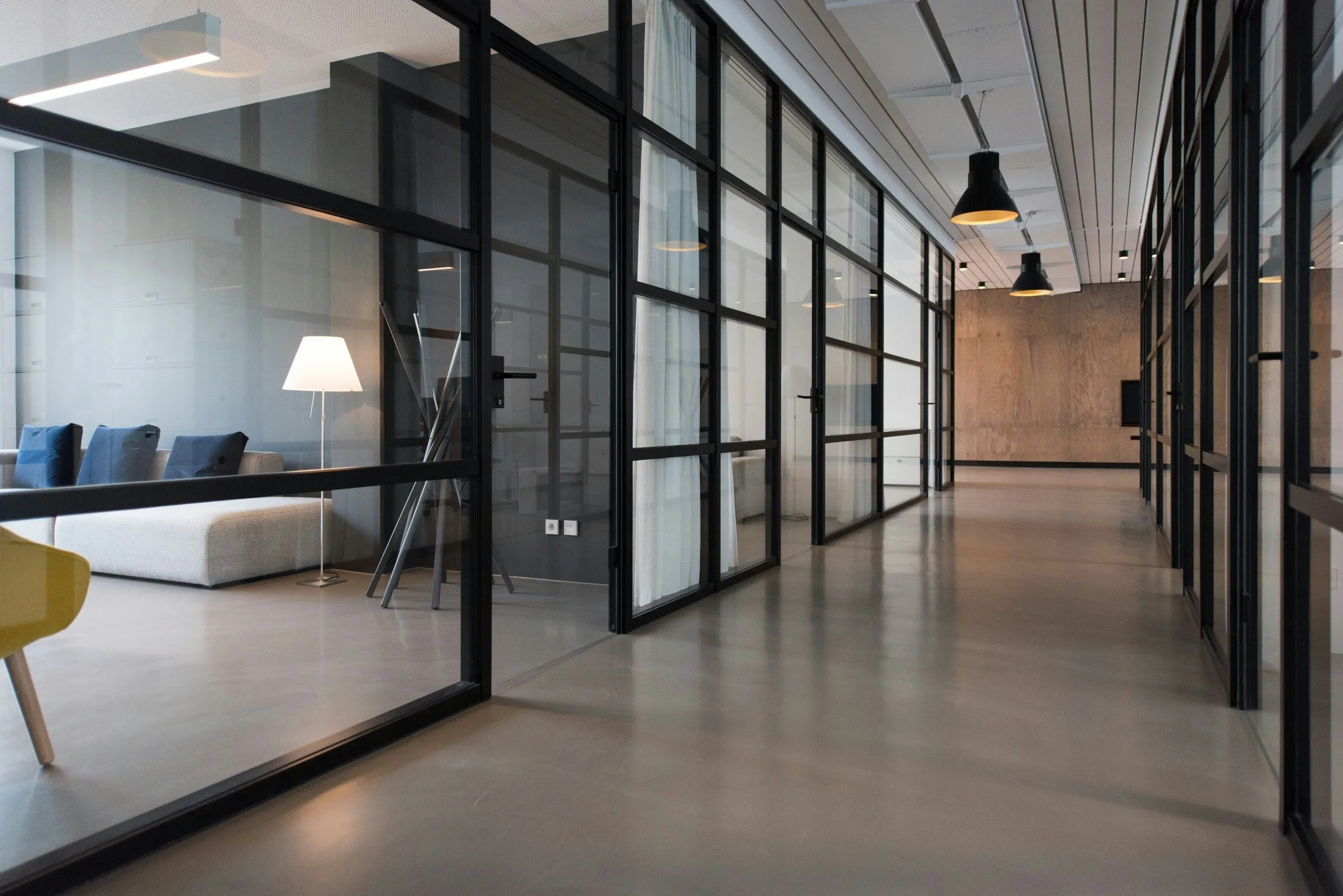
Grid cards with a hero image, metadata, excerpt, and optional author row with avatar.
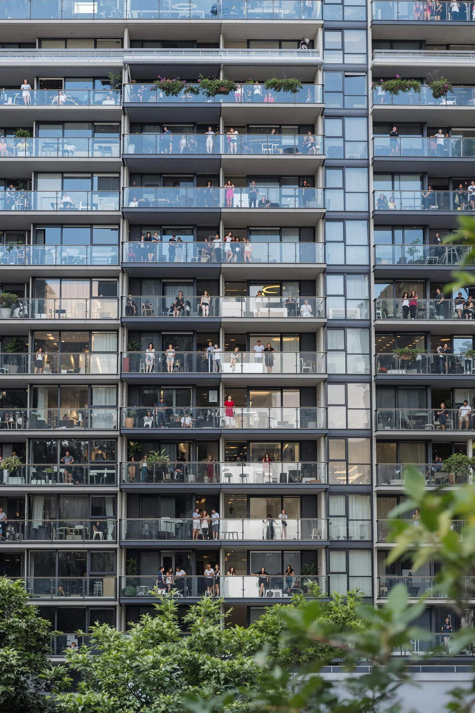
Product updates
31 January 2024 · 8 min read
Beyond spreadsheets: introducing levy forecasting for strata managers
Levy forecasting helps you map out a budget structure before diving into the details.

Samantha Novak
Product Design Lead

Product updates
8 January 2024 · 4 min read
New colour controls to elevate your owner communications
Instant Strata took a leap forward with brand controls, providing managers with a powerful toolkit for consistent building communications.

Christine Sotelo
Director of Product Marketing

Company
26 June 2023 · 6 min read
A note from the Instant Strata founders
A note from our founders on how Instant Strata's journey is shaping the next generation of strata management software.
Benn Stancil
CTO and Co-founder
import { CardGrid, BlogCard } from "@/components/ui/card"

<CardGrid columns={3}>
  <BlogCard
    href="/blog/levy-forecasting"
    category="Product updates"
    title="Beyond spreadsheets: introducing levy forecasting"
    excerpt="Levy forecasting helps you map out a budget structure…"
    date="31 January 2024"
    readTime="8 min read"
    imageSrc="/img/building/1.webp"
    imageAlt="Levy forecasting dashboard"
    author={{ name: "Samantha Novak", role: "Product Design Lead", avatarSrc: "/img/people/1.webp" }}
  />
</CardGrid>
Tone reference
Card props
| Prop | Type | Default | Description |
|---|---|---|---|
| tone | "bordered" | "accent" | "dark" | "bordered" | Surface colour. bordered = white + border + shadow. accent = lime-soft. dark = forest-mid for use inside dark sections. |
FeatureCard props
| Prop | Type | Default | Description |
|---|---|---|---|
| title | string | - | Young Serif heading below the visual slot. |
| description | string | - | Supporting body copy. |
| visual | ReactNode | - | Illustration or screenshot in the off-white visual area. Defaults to an abstract placeholder. |
| href | string | - | When set, renders as a link and shows a trailing Learn more label. |
| linkLabel | string | "Learn more" | Trailing link label with chevron. |
BlogCardFeatured props
| Prop | Type | Default | Description |
|---|---|---|---|
| category | string | - | Uppercase eyebrow above the title. |
| title | string | - | Post headline in Young Serif. |
| excerpt | string | - | Short summary paragraph. |
| imageSrc | string | - | Hero image for the left column. |
| imageAlt | string | - | Accessible alt text for the image. |
| linkLabel | string | "Read more" | Trailing link label with chevron. |
| href | string | - | Link destination: the entire card is clickable. |
BlogCardSimple props
| Prop | Type | Default | Description |
|---|---|---|---|
| category | string | - | Uppercase eyebrow label at the top. |
| title | string | - | Post headline in Young Serif. |
| date | string | - | Publication date. |
| readTime | string | - | Optional reading time, appended after the date. |
| href | string | - | Link destination: the entire card is clickable. |
BlogCard props
| Prop | Type | Default | Description |
|---|---|---|---|
| category | string | - | Uppercase eyebrow above metadata. |
| title | string | - | Post headline in Young Serif. |
| excerpt | string | - | Summary paragraph, clamped to three lines. |
| date | string | - | Publication date. |
| readTime | string | - | Optional reading time. |
| imageSrc | string | - | Hero image at the top of the card. |
| imageAlt | string | - | Accessible alt text for the image. |
| author | { name: string; role?: string; avatarSrc?: string } | - | Optional author row with Avatar at the bottom. |
| href | string | - | Link destination: the entire card is clickable. |